Tuesday, January 2, 2018
Chris Koelsch - Animation Reel 2018
Below is my animation/illustration reel for 2018. It contains many projects that I had the privilege of working on throughout 2017. I'm pretty proud of what I've done this year seeing as it was my first full year freelancing. That can be a very scary thing for a lot of different reasons, but it managed to keep me fairly busy and I'm proud of the work that came out of it. Hope you enjoy it.
Sunday, November 26, 2017
TnT Tuts - #9 - Animating Illustrated Text in After Effects Using Shape Layers
In this tutorial I show you how you can create a text in Illustrator and then animate it in After Effects using shape layers. I created a text for my 2018 reel using simple shapes in Illustrator. The idea was to overlap the shaped and use different blend modes to create various kinds of color combinations. I used the plugin Overlord to import my Illustrator assets straight into After Effects and create shape layers. From there I animated the paths in various ways to create a slick animation. No real tricks in this one, just good ol' fashion keyframing.
TnT Tuts - #6,7 & 8 - Illustrating, Rigging & Animating a Cat in After Effects
In this tutorial series I tackle illustrating, rigging and animating a cat in After Effects.
The first thing people should know about rigging a cat versus rigging a human is that it's double the work (because it is double the legs). Also animal walk cycles are all just slightly different. Dogs vary from cats, cats vary from horses, and so on. So each animal rig is it's own unique beast so to speak. This is why it's always good to have lots of references. I have several books that reference various animal run cycles with photos and information. These are vital to understanding just how different animals walk, because if you don't understand the basics then there is no way you'll be able to deviate and add your own creative spin on things.
Another thing to note is that most animals require an extra bone by the shoulder or foot, so this adds to the complexity of your rig.
Finally, the other difficulty with animal rigs is that they often require extreme flexibility, especially in cats. If you've ever seen a cat run you'll notice that their torso often stretches very wide on the jump and compresses very small on the landing. This doesn't seem like a big deal but in terms of looking realistic, getting this to work is what will set your rig apart from others. This flexibility can often be hard to pull off without breaking the rig as well.
In the following videos you'll see how I tackle these various challenges through the creative process. I found this to be one of the most flexible cat rigs I've ever created and I had a lot of fun animating with it.
Monday, November 13, 2017
TnT Tuts - #5 - Animating a Bicycle in After Effects
This weeks tutorial features a character riding a bike. You'll see how I use the same basic principles I've shown rigging characters with Duik, creating the bouncing ball, and using simple expressions to make this rig.
Monday, November 6, 2017
Tnt Tuts - #4 - Bouncing Balls
So many exciting things to talk about for this one. Finally got a new microphone for the podcast, so now everything is looking and sounding professional. Everything except me that is. Now that I have all of the streaming logistics figured out, I'm happy I have the time to plan out my tutorials more. I want them to be off the cuff, but I also want them to be prepared enough so that people can actually learn something. In this tutorial it was more or less me just trying to work through something rather than explaining it very well. I will have to work on that for the future. Regardless, here is my tutorial on ball bouncing.
Thursday, November 2, 2017
Tnt Tuts - #3 - Character Rigging with RubberHose and Joysticks ‘n Sliders
In this tutorial I use RubberHose, Joysticks 'n Sliders, and Duik all together to create a powerful character rig.
Monday, October 30, 2017
Tnt Tuts - #2 - Character Animation in After Effects with Duik: Run Cycles
My second tutorial stream touches on making run cycles with Duik. You see a lot of walk cycles out there on the internet and I wanted to represent run cycles a little bit more. In a lot of ways they are more flexible and fun that run cycles. To catch my steams live just follow me on Twitch.
Wednesday, October 25, 2017
Tnt Tuts - #1 - Character Creation, Rigging, & Animation Feat. Overlord
I just finished my first Twitch stream and I hope to do more in the future. For this first tutorial I decided to try out Battle Axe's new extension for After Effects called, Overlord. Essentially this extension allows to to work more seamlessly between Illustrator and After Effects. You can send your layers, text, and swatches back and forth from Illustrator and After Effects and all of your changes will update seamlessly. To see how I created this nifty little vampire just watch the video below.
Tuesday, September 26, 2017
The Year of Plug-ins
I have to start out by saying that I was never a huge fan of plug-ins when I was first learning After Effects and animation. I mainly didn't like plug-ins because they cost money, and any animator starting out knows that that is something hard to come by. It also frustrated me to watch a tutorial on something cool, only to have the person in the video tell me to go and buy a plug-in to achieve the effect. It always seemed like such a copout. I wanted to learn how to make these things with the program itself, so that is what I did. The downside to that path is that it takes much more time and work to get the effect; however, the upside is that you gain a better understanding in how the effects are achieved. In the long run I would suggest that anyone starting out in After Effects at least try to make an effect yourself before going and buying a plug-in. Plug-ins are great, but they can really become a crutch if you don't know how to make them yourself.
Regardless, over the past year I have found myself buying more plug-ins and I have to say I've found some really great ones.
Dojo Shifter - Easily sequence layers in After Effects. Another simple but effective one.
Motion - A robust plug-in for adding different motion to your elements using only a simple interface. Good for making complex motions easily.
Pixellate It - Simple for giving a pixel look in After Effects
Boil It - Simple for giving a wiggle look in After Effects
Regardless, over the past year I have found myself buying more plug-ins and I have to say I've found some really great ones.
Duik
Duik has been the one plug-in that I've always had for character rigging. The reason for that is because it was free! Not only is it free, but it's actually an extremely robust interface for creating character rigs. This is what I learned on and would truly recommend it for anyone out there trying to get into character animation. I don't think there is anything as customizable or robust when you know how to use it. That being said, Duik can be quite intimidating to start out with.RubberHose
This is where RubberHose comes in. I had been hearing a lot about RubberHose over the past few years but was always hesitant to try it. For one, I already had Duik, so I felt I really didn't need something that did essentially the same thing. The other reason was that unlike Duik, RubberHose cost money. Regardless, I finally took the plunge this year and I have to say that I am finding uses for RubberHose. When it comes to rigging legs, RubberHose just seems to have a smoother look to the animation, where Duik can sometimes have issues with leg locking. That being said, RubberHose is still a more basic program. It's definitely what I would recommend for someone just starting out with character animation because the interface and set-up are a little more user friendly than Duik. But, as I said Duik can be more customizable in the end.Joysticks 'n Sliders
Ok. This is my favorite plug-in this year. Joysticks 'n Sliders is an awesome tool that allows you to do what the name implies - make joysticks and sliders. That being said, it's an extremely powerful tool for tweening character animations and making an overall more robust and professional rig. This is especially evident when it comes to face rigs. Duik and RubberHose work great for rigging bodies, but any good animator knows that the face can hold so much expression and emotion. Thus the need to easily animate things like eyebrows, blinks, and mouths. Up until recently, I would always animate these layers individually, which was honestly a time consuming chore. With Joysticks 'n Sliders I can now animate all the facial assets easily in one simple location. The possibilities are endless with this one.Honorable Mentions
Butt Capper - Easily add caps to strokes in After Effects. Seems simple, but it's seriously so helpful.Dojo Shifter - Easily sequence layers in After Effects. Another simple but effective one.
Motion - A robust plug-in for adding different motion to your elements using only a simple interface. Good for making complex motions easily.
Pixellate It - Simple for giving a pixel look in After Effects
Boil It - Simple for giving a wiggle look in After Effects
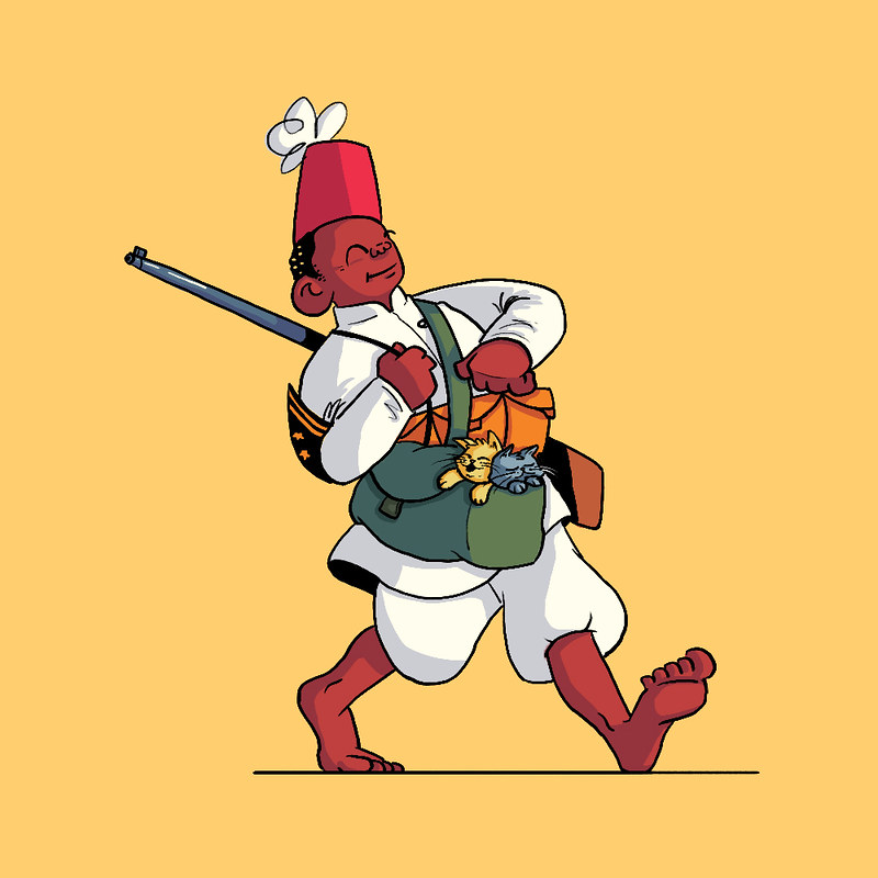
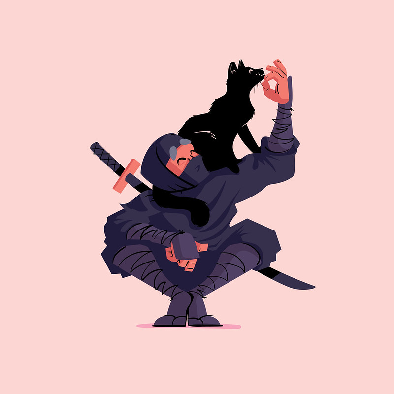
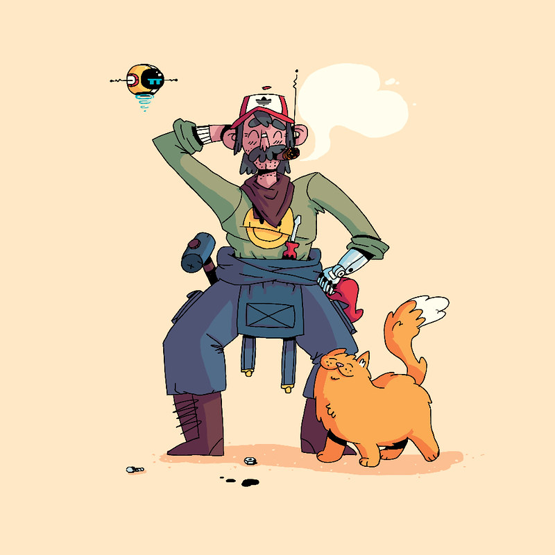
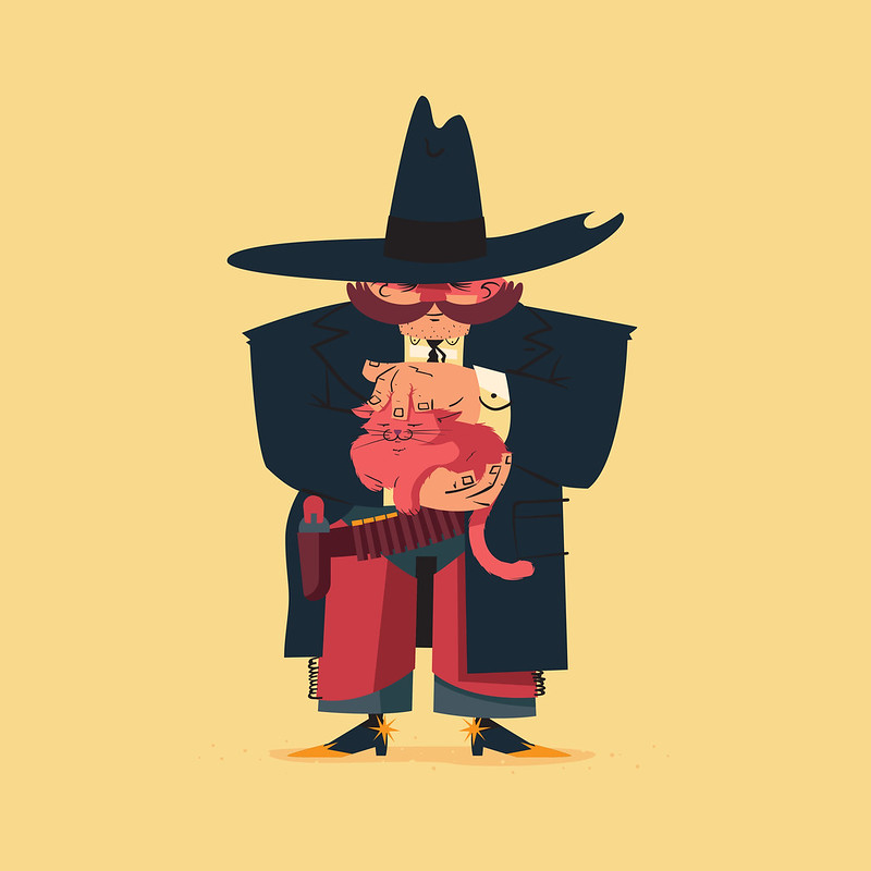
Feline Friends
One of the things I've been working on this past year is creating characters. I've created over 200 characters in the past year and that has really helped me grow as both a creator and an artist. Making something new everyday pushed me to start drawing every day. Honestly since becoming an animator I was beginning to spend most of my time in Illustrator and After Effects. I hadn't realize how much I missed the simple idea of sketching something out.
Long story short, this has lead to a small ongoing series I'm calling, Feline Friends. Basically this is a collection of characters from all walks of like that just happen to have cat companions (as you can see I love alliteration).
You can see what I've made so far below and also follow me on Instagram and search my hashtag #felinefriends for more.
Meet the Engineer Preserving The Last Analog Motion Graphics Machine
History lesson for all you animators out there. Do you know where the term "plug-in" came from? I'll be honest that I had never really thought about it until I watched this video. I'm also posting this video because I believe the work this man is making is pretty prevalent today even though the tools he is using are decades old. It makes me think of shows like Stranger Things. That intro is so iconic today yet it obviously takes all of it's cues from analogue motion graphics of the past. I'm just always surprised at how styles seems to go in a loop and how certain things can really never be replaced.
Friday, September 1, 2017
Lastman - Episode 1
Check out this awesome cartoon from Mondo Media. This is definitely satiating my need for cartoon violence since I finished One Punch and Attack on Titan.
Day 234/235: Devin
Recently had the pleasure of doing a commission for someone who reached out to me. It's not very often I do these sort of things, but I was excited to give it a try none the less.
Basically Devin reached out to me looking for a new avatar to use for his social media. He also wanted a short animation featuring the character. He sent me some references of my work he liked and some other personality notes. From there I got to work in Illustrator.
I didn't sketch this one out, just went straight into illustrator working with shapes. I first created the portrait, seeing as how that was the most detailed and important aspect, and then moved on to creating a body for the animation.
Once I had all the art created I went into After Effects, rigged him up with Duik, and began concepting what I wanted the animation to be. Devin had mentioned wanting it to be basketball related, so I went with that. My initial idea was to have him running and dribbling, but since I always do run/walk cycles, I challenged myself to think a little harder on it. I then came up with the idea of playing with the basketball a little. There's so many different things you can do with the basketball that are fun to animate. Below is the result.
The client was happy with everything but the color palette...but I like the original better ;)
Thursday, August 10, 2017
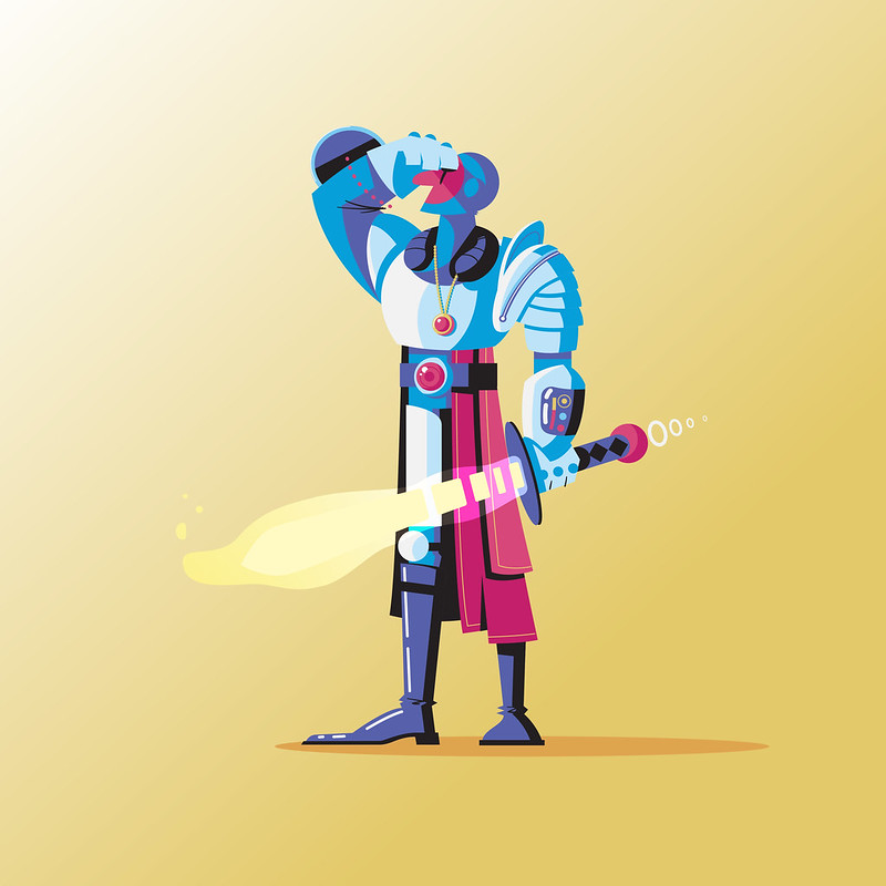
Day 225: Space Knight
I haven't done an in depth process video in quite a while, so I thought it would be fun to do a little timelapse of Day 225: Space Knight.
As usual, this one started with a simple sketch. I had like 6 different ideas going into this sketch and was struggling bringing them all together. Basically I wanted to take the idea of a knight and bring it into the future. I feel like knight armor and space suits share some similar attributes. That and I'm a sucker for both space and knights.
After the sketch was scanned in I brought the art into illustrator and just went at it. Not a whole lot to say about it. I am enjoying getting back into illustrator lately. I've been playing in Photoshop so much that it's a nice break to just play with vector shapes. That and I'm much quicker in Illustrator so it's a little less stressful for me.
I was pleasently surprised with how it turned out given that I was struggling so much with the initial design. Just shows that sometimes you have to keep working at something even if you're unsure how it will turn out.
Wednesday, August 9, 2017
Day 223/224: International Cat Day
Normally I don't feed into these "holidays" that seem to be every single day for every different kind of thing you can imagine. But a holiday that celebrates cats I just can't resist. Here are two dailies I created inspired by the theme.
I sketched them both out and created them in Illustrator. Normally I don't use the blob brush in Illustrator that much but since I've been drawing with the Wacom more I am a little more into the idea. The base of these characters are just vector shapes and then I drew on all the black lines. I actually really liked the balance of clean lines and hand drawn that this process produced.
I sketched them both out and created them in Illustrator. Normally I don't use the blob brush in Illustrator that much but since I've been drawing with the Wacom more I am a little more into the idea. The base of these characters are just vector shapes and then I drew on all the black lines. I actually really liked the balance of clean lines and hand drawn that this process produced.
Friday, August 4, 2017
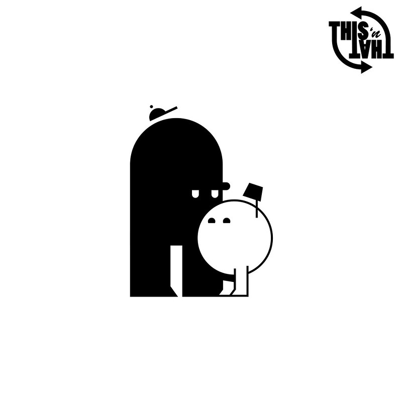
Day 219/220: This 'n That
Oh look, another 2 for 1! Yes, I've been busy with catching up on some real work and also a little lazy as well. So for that, you get two characters in one post again.
These two were actually spun from an idea I wanted to pursue with my Vimeo profile. Every profile has a banner video now and I thought it would be fun to animate a specific video just for my Vimeo banner. I knew I wanted some characters and then I thought "Hey, it would be cool to brand this somehow!" With that in mind I created some very simple characters to represent "This" and "That". I wanted to make them simple to match my brand, but I also thought that would help me focus more on the actual character animation and less on how they looked. Sometimes the simplest characters can be the most expressive. I also thought it fit the theme to make them opposites in a way (not to mention that usually plays better with comedy.)
I haven't started animating them yet. Not quite sure how I want to go about them and it will take some tinkering. Also I'm heading back to Toledo for the weekend and just don't have the time right now to mess with it. That being said, keep your eyes peeled in the futue for an update on these two.
Wednesday, August 2, 2017
Day 218: Apple Jacker
This daily is an example of work overlapping with this project. Occasionally I will get a new job that requires some fresh characters. No pun intended. As you can see from the mock up below, this piece has a photoshopped type of style. The apple is a photograph and the rest of the elements are just hand drawn in Photoshop. This piece calls for a lot of apple and pear characters so I made a mockup of what one might look like to test it in After Effects. If project timelines allow it, which they rarely do, it's always good to practice with an animation rig beforehand so you can spot any pain points and redesign later.
Tuesday, August 1, 2017
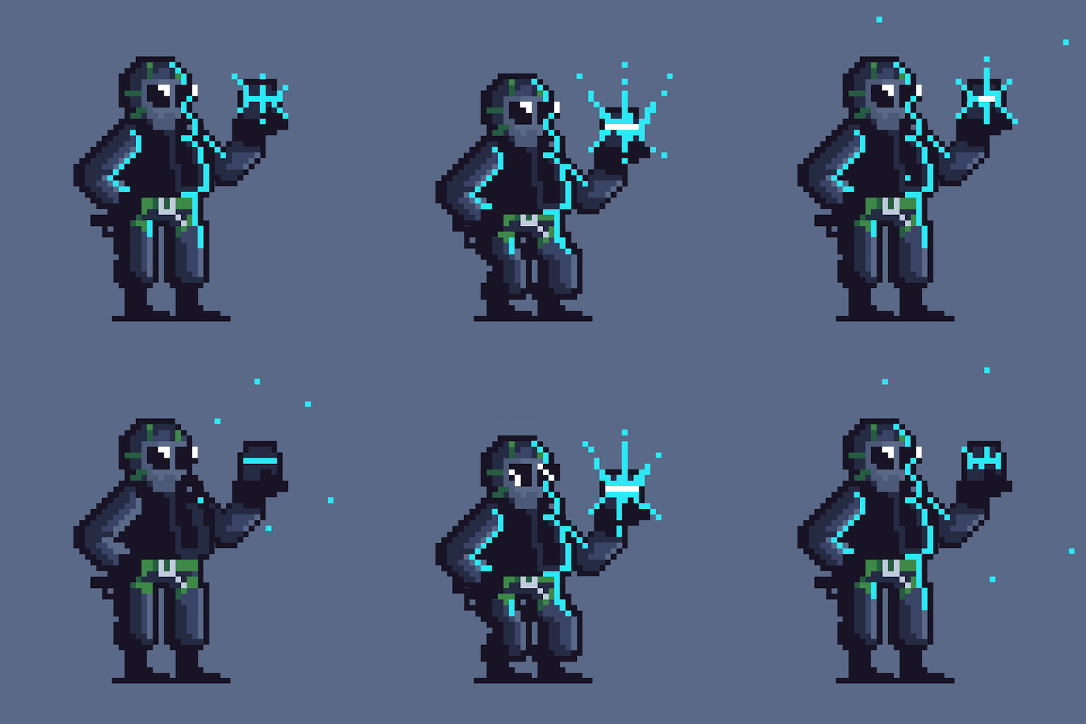
Day 217: EMP Grenade
Pixel art is something that I'm fascinated by. As an avid gamer I've grown up with this art, and with indie games at an all time popularity, there is no shortage of amazing pixel art and animation out there to look at. I've been trying to up my game a little bit just for fun. It's a serious challenge to work with, well, pixels. It takes a lot of design know-how to use just enough color and pixels to help the viewer understand what they're looking at.
I dabbled making art in the past but I always used Illustrator or Photoshop. It wasn't until I got a serious interest in making pixel art that I found out about Aseprite. After following a bunch of pixel artists on Twitter I discovered this little gem of a program. It makes it very easy to create pixel art and animation, as well as export in a variety of ways.
For this daily I created Thatcher, a character from the video game Rainbow Six: Siege. I've made Thatcher 3 times in my dailies thus far. I'm not quite sure what my obsession is with revisiting him. I really just like the design of the Siege characters. It's also fun taking something so detailed and breaking it down into its simplest form. I hope to keep making more pixel animations. It seriously is hard and takes a lot of time, but I can see myself slowly but surely getting a little better at it...I think.
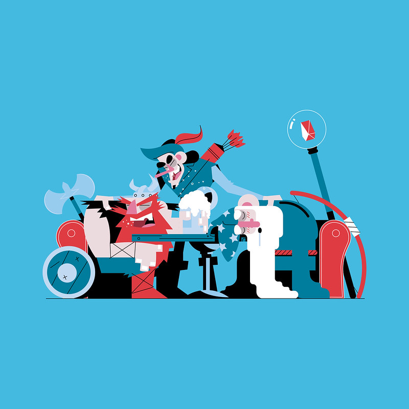
Day 214/215/216: Usual Suspects
Well it's been a long time since I have written a post. Seems I didn't get better at blogging. The last time I posted was for day 38, which honestly feels like a lifetime ago. I know my history doesn't speak well for me, but I am going to try and make a post for every daily now. You can come here and read a little bit more about my process for each day. My struggles. My successes. With that being said, let's get to it.
As you can see, this daily is an example of me sort of "cheating" and doing 3 characters in one scene. For those that don't know, these dailies from from a project in which I'm trying to create a new illustrated or animated character every day for an entire year. As of today I have created 216 of 365. On rare occasions I will put a few days into one daily, but this is usually only when I get far behind. I've actually only ever done it one other time and it was when I was on vacation.
I will say that making the time is the hardest thing I deal with on this project. Some days fitting a drawing in is very easy, sometimes it comes out of work. Then there are days when I'm out with friends, busy with actual work, or just feeling burnt out. But, regardless of the pain, what I make every day generally comes out successful. And even if I don't love every piece as much as the next, I definitely learn something with each new attempt.
So, knowing I was going to put 3 characters together for this one, I thought it would be fun to put some fantasy characters all together at the bar. I started by sketching out my idea. I honestly didn't have a plan for composition when I began. I just started drawing the viking and built out from there. When I finished I noticed the archer was WAY too big in the sketch. Being lazy as I am I resigned to fixing it in Illustrator. I honestly wasn't sure if I wanted to use Illustrator or Photoshop for this particular piece, but in the end I felt the crisp shapes and lines in Illustrator would lend better to the idea I was going for.
To compliment the clean and somewhat simple shapes of the piece I decided to keep the color palette simple as well.
In the end I really enjoyed this making this one. Sometimes fitting all these characters into one scene is more fun because I can have more interaction and play around with details more. On the normal dailies it can be a little harder to do that.
Thursday, January 26, 2017
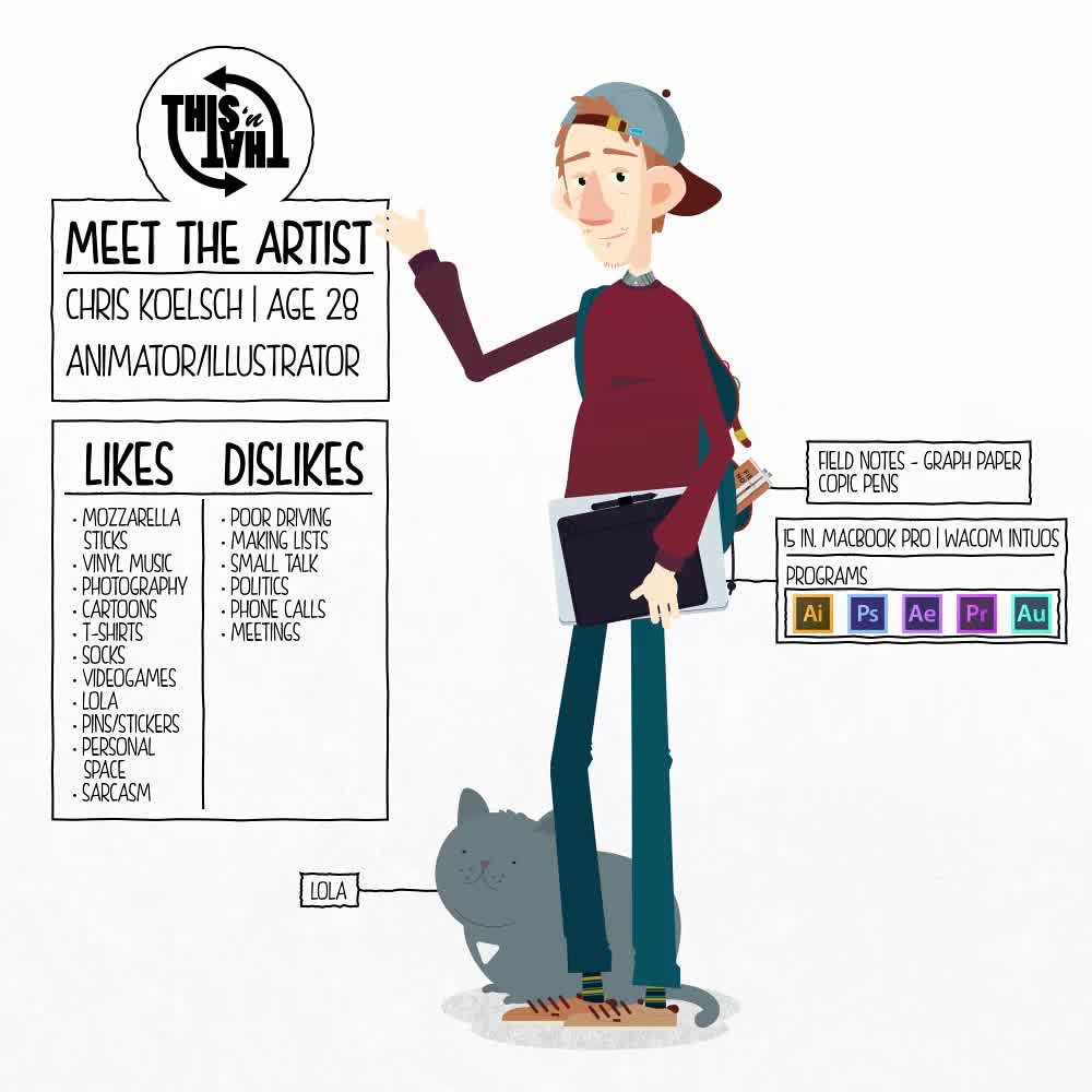
Day 38: Meet the Artist
So Instagram is doing this Meet the Artist thing and it seemed like a fun way to get my daily done. Here's me.
Subscribe to:
Comments (Atom)


