Thursday, August 10, 2017

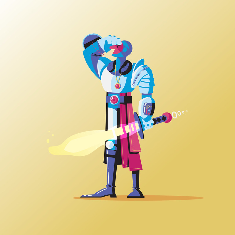
Day 225: Space Knight

I haven't done an in depth process video in quite a while, so I thought it would be fun to do a little timelapse of Day 225: Space Knight.

As usual, this one started with a simple sketch.  I had like 6 different ideas going into this sketch and was struggling bringing them all together. Basically I wanted to take the idea of a knight and bring it into the future.  I feel like knight armor and space suits share some similar attributes. That and I'm a sucker for both space and knights.


After the sketch was scanned in I brought the art into illustrator and just went at it.  Not a whole lot to say about it.  I am enjoying getting back into illustrator lately. I've been playing in Photoshop so much that it's a nice break to just play with vector shapes.  That and I'm much quicker in Illustrator so it's a little less stressful for me.


I was pleasently surprised with how it turned out given that I was struggling so much with the initial design. Just shows that sometimes you have to keep working at something even if you're unsure how it will turn out.

Day 225: Space Knight

Wednesday, August 9, 2017

Day 223/224: International Cat Day

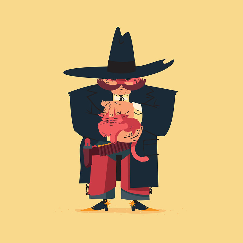
Normally I don't feed into these "holidays" that seem to be every single day for every different kind of thing you can imagine. But a holiday that celebrates cats I just can't resist.  Here are two dailies I created inspired by the theme.


I sketched them both out and created them in Illustrator. Normally I don't use the blob brush in Illustrator that much but since I've been drawing with the Wacom more I am a little more into the idea.  The base of these characters are just vector shapes and then I drew on all the black lines.  I actually really liked the balance of clean lines and hand drawn that this process produced.


Day 223: Feline Meditation

Day 224: High Noon Kitty

Friday, August 4, 2017

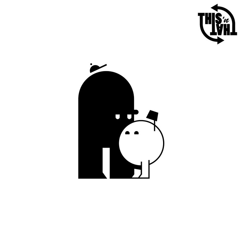
Day 219/220: This 'n That

Oh look, another 2 for 1! Yes, I've been busy with catching up on some real work and also a little lazy as well. So for that, you get two characters in one post again.

These two were actually spun from an idea I wanted to pursue with my Vimeo profile. Every profile has a banner video now and I thought it would be fun to animate a specific video just for my Vimeo banner. I knew I wanted some characters and then I thought "Hey, it would be cool to brand this somehow!" With that in mind I created some very simple characters to represent "This" and "That". I wanted to make them simple to match my brand, but I also thought that would help me focus more on the actual character animation and less on how they looked. Sometimes the simplest characters can be the most expressive. I also thought it fit the theme to make them opposites in a way (not to mention that usually plays better with comedy.)

I haven't started animating them yet. Not quite sure how I want to go about them and it will take some tinkering. Also I'm heading back to Toledo for the weekend and just don't have the time right now to mess with it. That being said, keep your eyes peeled in the futue for an update on these two.

Day 219/220: This 'n That

Wednesday, August 2, 2017

Day 218: Apple Jacker

This daily is an example of work overlapping with this project. Occasionally I will get a new job that requires some fresh characters. No pun intended. As you can see from the mock up below, this piece has a photoshopped type of style. The apple is a photograph and the rest of the elements are just hand drawn in Photoshop. This piece calls for a lot of apple and pear characters so I made a mockup of what one might look like to test it in After Effects. If project timelines allow it, which they rarely do, it's always good to practice with an animation rig beforehand so you can spot any pain points and redesign later.

Tuesday, August 1, 2017

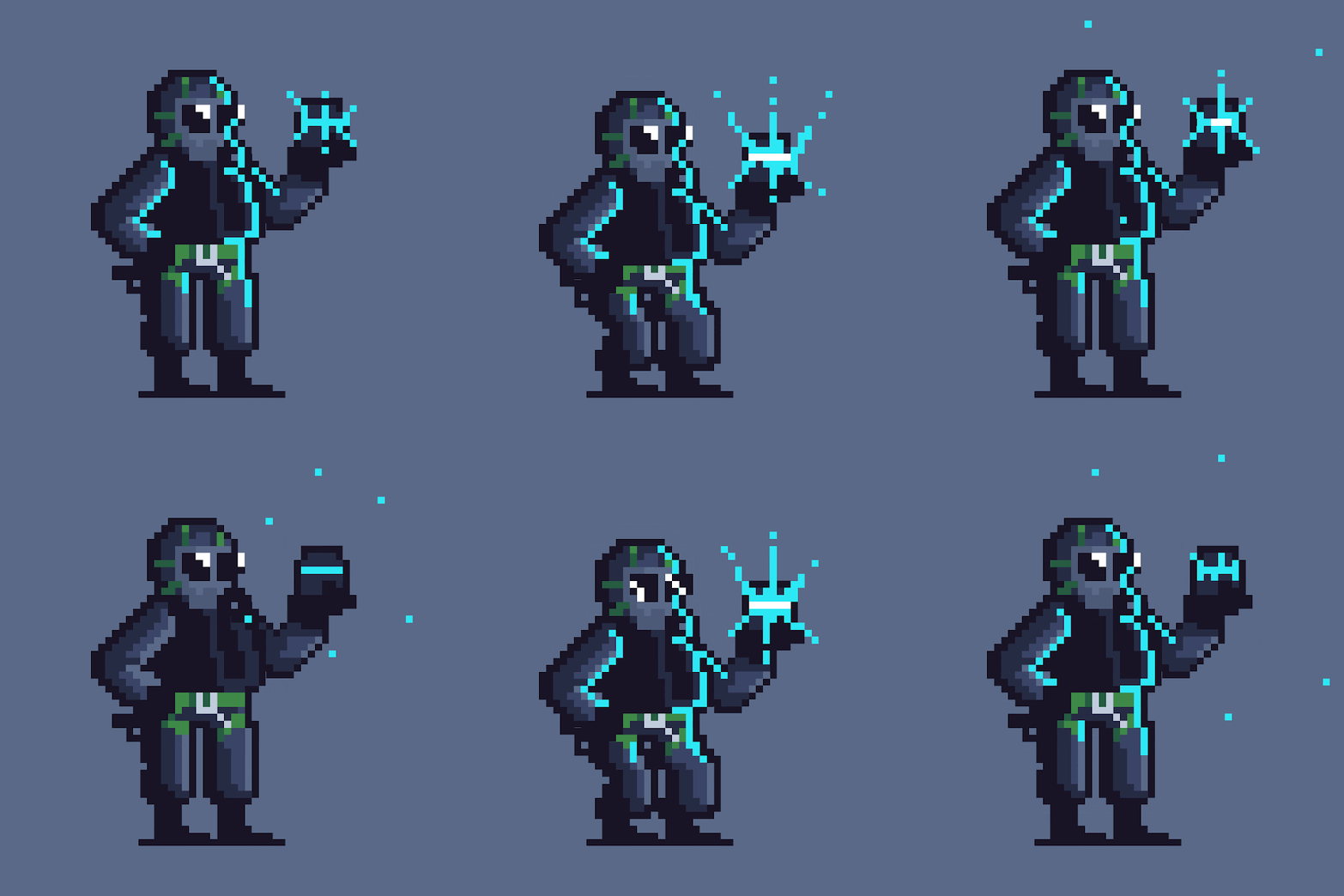
Day 217: EMP Grenade

Pixel art is something that I'm fascinated by. As an avid gamer I've grown up with this art, and with indie games at an all time popularity, there is no shortage of amazing pixel art and animation out there to look at. I've been trying to up my game a little bit just for fun. It's a serious challenge to work with, well, pixels. It takes a lot of design know-how to use just enough color and pixels to help the viewer understand what they're looking at.

I dabbled making art in the past but I always used Illustrator or Photoshop. It wasn't until I got a serious interest in making pixel art that I found out about Aseprite. After following a bunch of pixel artists on Twitter I discovered this little gem of a program. It makes it very easy to create pixel art and animation, as well as export in a variety of ways.

For this daily I created Thatcher, a character from the video game Rainbow Six: Siege. I've made Thatcher 3 times in my dailies thus far. I'm not quite sure what my obsession is with revisiting him. I really just like the design of the Siege characters. It's also fun taking something so detailed and breaking it down into its simplest form. I hope to keep making more pixel animations. It seriously is hard and takes a lot of time, but I can see myself slowly but surely getting a little better at it...I think.

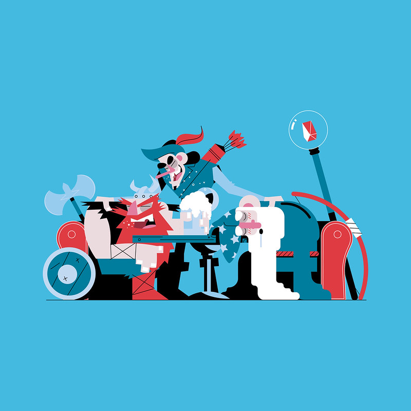
Day 214/215/216: Usual Suspects

Well it's been a long time since I have written a post. Seems I didn't get better at blogging. The last time I posted was for day 38, which honestly feels like a lifetime ago. I know my history doesn't speak well for me, but I am going to try and make a post for every daily now. You can come here and read a little bit more about my process for each day. My struggles. My successes. With that being said, let's get to it.

As you can see, this daily is an example of me sort of "cheating" and doing 3 characters in one scene. For those that don't know, these dailies from from a project in which I'm trying to create a new illustrated or animated character every day for an entire year. As of today I have created 216 of 365. On rare occasions I will put a few days into one daily, but this is usually only when I get far behind. I've actually only ever done it one other time and it was when I was on vacation.

I will say that making the time is the hardest thing I deal with on this project. Some days fitting a drawing in is very easy, sometimes it comes out of work. Then there are days when I'm out with friends, busy with actual work, or just feeling burnt out. But, regardless of the pain, what I make every day generally comes out successful. And even if I don't love every piece as much as the next, I definitely learn something with each new attempt.

So, knowing I was going to put 3 characters together for this one, I thought it would be fun to put some fantasy characters all together at the bar. I started by sketching out my idea. I honestly didn't have a plan for composition when I began. I just started drawing the viking and built out from there. When I finished I noticed the archer was WAY too big in the sketch. Being lazy as I am I resigned to fixing it in Illustrator. I honestly wasn't sure if I wanted to use Illustrator or Photoshop for this particular piece, but in the end I felt the crisp shapes and lines in Illustrator would lend better to the idea I was going for.


To compliment the clean and somewhat simple shapes of the piece I decided to keep the color palette simple as well.

In the end I really enjoyed this making this one. Sometimes fitting all these characters into one scene is more fun because I can have more interaction and play around with details more. On the normal dailies it can be a little harder to do that.

Day 214/215/216: Usual Suspects